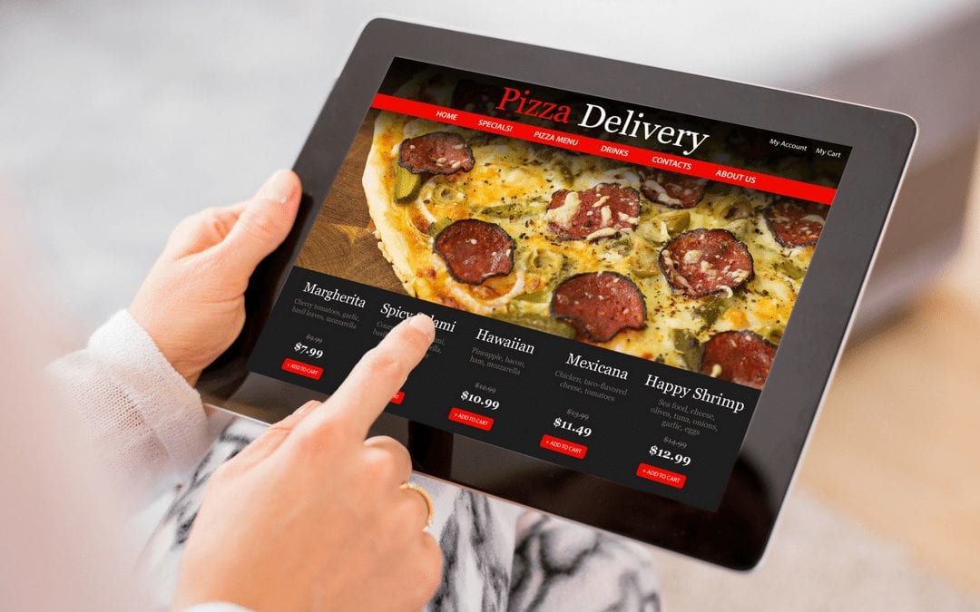
Restaurant web design is one of my favorite specialties. Not only are there many different kinds of eateries in and around my home city of Philadelphia, but each has a unique story and focus. That means an interesting web design challenge, and something that helps me to build a healthy appetite while I work.
In a lot of ways, restaurant web design is like building a web presence for any small business. However, there are a few distinct differences and subtleties you have to pay attention to. So, whether you’re a web designer or a restaurant owner, today I’m going to give you a handful of tips you can use to make your website as appealing as possible.
Here are my top five tips for tasty restaurant web design…
#1 Include Lots of Photos in Your Restaurant Web Design
We “taste” food with our eyes before it ever makes it to our mouths. For that reason, you can build interest in your restaurant, and entice diners to stop in, by posting photos from your restaurant all over your website. Include pictures of the food you serve, of course, as well as your friendly staff and inviting dining room. You might even want to throw in a couple of shots from the kitchen so everyone can see the you prioritize cleanliness and fresh ingredients.
#2 Give Your Restaurant Web Design a Page for Your Menu
Some diners will be happy to stop in just based on the photos you have within your restaurant web design. However, we all know more than a few picky eaters, and some customers might have food allergies or diet restrictions. One way to bring these folks into your restaurant is by posting a page with your current menu where they can see it. This may also have the positive side effect of getting people who do stop by your restaurant to order food faster (meaning more turnover for you).
#3 Use a Responsive Web Design for Mobile Customers
More than half of all internet users access the web via phones and tablets, including people who are hungry and on the move. By opting for a responsive layout for your restaurant web design, you ensure these customers can access your site with no problems from any mobile device. Include phone numbers and online reservation tools and you may see a big boost in calls or walk-in traffic.
#4 Emphasize Your Location(s)
Almost any business can benefit from local search engine optimization, but it’s especially critical for restaurants. You want Google (and hungry people) to know exactly where you’re located in the real world. If you have multiple restaurants, put each one on a separate page. Also, whether you have one location or dozens, make sure you include street addresses, maps, and driving directions to help people find their way to your restaurant.
#5 Link to Local Review Websites From Your Restaurant Web Design
As important as photos, menus, and locations are, many of your customers are going to want to read reviews about your restaurant before they actually stop in to eat. It’s important for you to establish profiles on local review sites (like Yelp and TripAdvisor), and then to keep tabs on your online reputation going forward. Luckily, you can use convenient services that help you stay on top of the feedback you get from diners for just a few dollars a month. Every restaurant owner should be taking advantage of those tools.
A good restaurant web design can help you fill every table and establish a reputation within your community. And, if you follow the five tips I’ve outlined in this article, you’re sure to end up with a finished product that looks as good as the dishes you serve.
If you need a Philadelphia restaurant web design company that knows how to serve up a successful online marketing plan, make a reservation to speak with the team at Biondo Creative today to learn more!
